
Mylar Bag Labels Sized to the Pouch You're Actually Filling
Matte mylar is a difficult surface and most labels lift at the corners within a week. Ours don't, and they're sized to standard 3.5g through 28g pouches so your facts panel fits the first time.
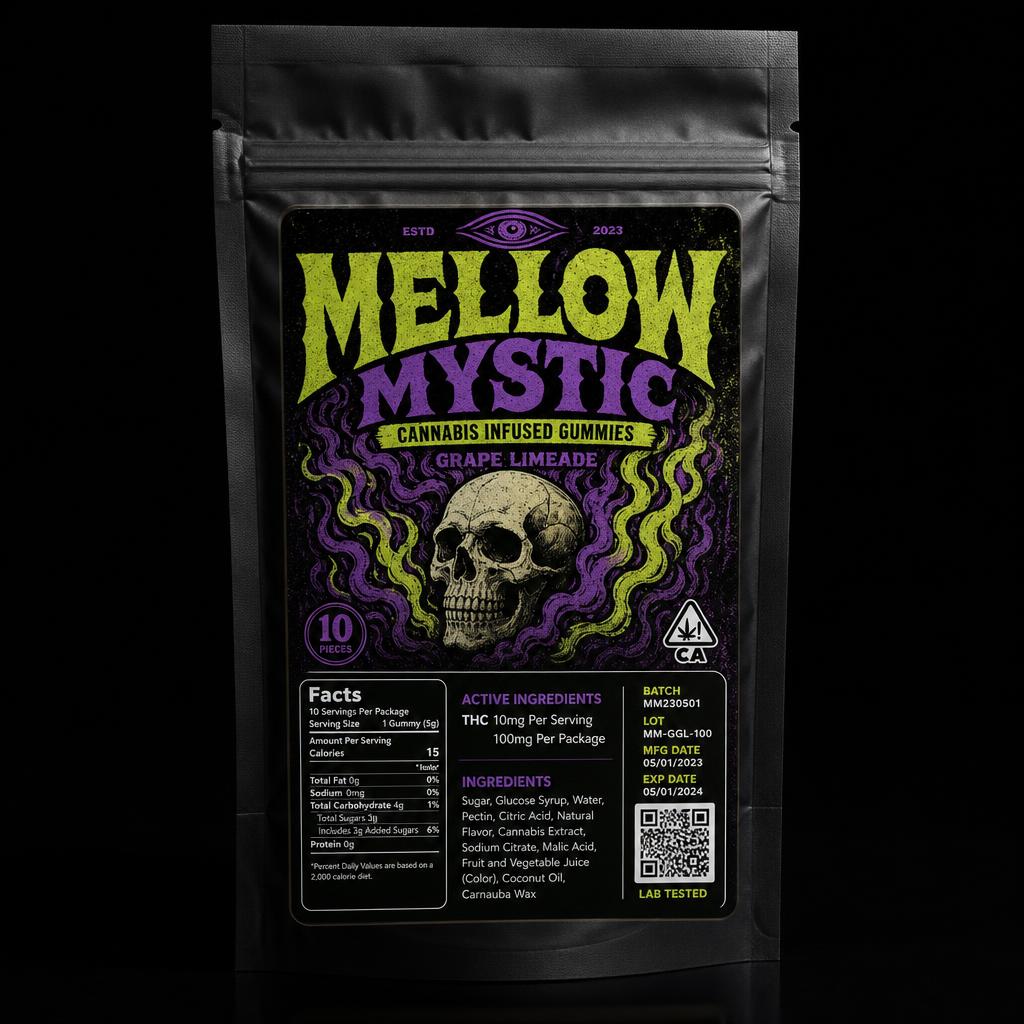
Mylar is the default packaging for flower and edibles because it's cheap, opaque and child-resistant in the right configuration. It's also a genuinely awkward label surface: the matte soft-touch finish that makes the bag feel premium is the same finish that lets a poorly specified label peel at the corners after a few days in a pocket or a delivery bag.
The fix is adhesive and construction, not artwork. Our 3.4 mil vinyl with premium lamination has enough conformability to sit flat on the slight texture of a mylar face and enough adhesive to stay there. If your current labels curl at the corners, that's what's failing.
The second half of the problem is sizing. Buy a stock 3.5g pouch and you have roughly a 3" x 4" printable face, minus the zipper and the gusset. Design a 4" x 5" label for it and you'll be trimming by hand or wrapping the seam.
- Common size
- 3" x 2" front face for 3.5g pouches
- Material
- White 3.4 mil vinyl (clear available)
- Laminate
- Matte for seamless look, gloss for shelf pop
- Max label size
- 10" x 10"
- Minimum order
- 25 labels
- Artwork
- Vector PDF/AI/EPS or 300 DPI raster
Label sizes by pouch capacity
These are the sizes that fit the most common stock pouches on the market. Measure your specific bag before ordering, supplier dimensions vary by a quarter inch or so, but this is the right starting point.
- 3.5g pouch (about 3.5" x 5" bag): 3" x 2" front label, or 3" x 3.5" full face
- 7g pouch (about 4" x 6" bag): 3.5" x 2.5" front, 3.5" x 4" full face
- 14g pouch (about 5" x 8" bag): 4" x 3" front, 4.5" x 5" full face
- 28g pouch (about 6" x 9" bag): 5" x 3.5" front, 5" x 6" full face
- Back panel for required information: match the front width, 2"–3" tall
Front face art, back panel facts
The strongest mylar layouts split the job. The front carries the brand, big illustrated art, heavy type, strain or flavor name, and nothing else competing with it. The back carries the required panel: potency, ingredients, allergens, batch and lot, packaged-on date, warning block and COA QR code.
Splitting it this way means your front art can go edge to edge without a facts block cutting into it, and your required text gets a full panel at a readable size instead of being squeezed into a corner.
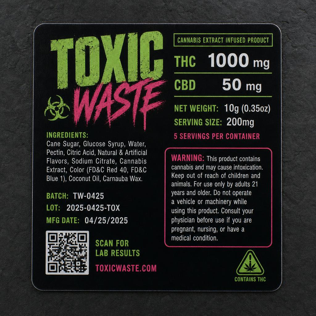
Why labels peel off mylar, and how to stop it
Three things cause corner lift. First, the label is too close to the bag's edge or seam, leave at least a quarter inch of bag on every side of the label. Second, the label spans the zipper or the bottom gusset, so the bag flexes and the adhesive shears. Third, the stock is too rigid to conform to the soft-touch texture.
Keep the label on the flat face, inside the seams, on laminated vinyl, and the failure mode disappears. If you're applying by hand, apply from the center outward and press with a squeegee or a card rather than a thumb.
- Stay 0.25" clear of every seam, zipper and gusset
- Never span the zipper track with a single label
- Apply center-out and squeegee, don't thumb-press
- Let filled bags settle for a few minutes before stacking
White, clear and matte on black mylar
Black matte mylar is the default look in this category, and it changes how you should spec material. White vinyl gives you an opaque canvas so your neon greens and violets print at full saturation, that's what almost every strong-looking pouch is using. Clear vinyl over black mylar only works if your art is light-on-dark by design; anything dark will vanish.
Matte laminate on a matte bag gives the seamless printed-pouch look at a fraction of custom-printed-bag cost. Gloss laminate makes the art pop harder but reads as a label rather than as packaging. Both are correct, it depends whether you want the label to disappear or to be the shelf hook.
Frequently asked questions
What size label fits a 3.5g mylar bag?
A 3" x 2" front label suits most 3.5g pouches, or 3" x 3.5" if you want a full-face design. Measure your specific bag first, stock pouch dimensions vary between suppliers.
Why do my current labels peel off the mylar?
Almost always because the label crosses a seam, zipper or gusset, sits too close to the bag edge, or is printed on stock too rigid to conform to soft-touch mylar. Keep it on the flat face with a quarter inch of clearance on laminated vinyl and it stays put.
Should I use one label or a front and a back?
Two is usually better. Front for brand art, back for the required potency, ingredient, batch and warning panel. It keeps both readable and lets your front artwork run edge to edge.
Can I get a matte finish that matches a matte black bag?
Yes. Matte lamination on white vinyl over matte mylar reads close to a directly printed pouch, which is the look most brands are after without paying for custom bag printing.
Print it on laminated waterproof vinyl
25 minimum, any shape, any size up to 10 inches. Live pricing while you configure.
Configure cannabis labelsMore in this series
Print specs at a glance
Ready to design yours?
Free proofs · 25 piece minimum · Made in USA
25 minimum, any shape, any size up to 10 inches. Live pricing while you configure, no quote request, no sales call.
Premium custom stickers made in the USA. Fast turnaround, free shipping on orders over $75.
- Die Cut Stickers
- Kids Name Stickers
- All Stickers
Industries
- Service Businesses
- Restaurants
- Breweries
- Real Estate
- Food Trucks
- Stickers in California
- Stickers in Texas
- Stickers in Florida
- Stickers in New York
- Cannabis Label Configurator
- About Us
- Help Center
- Ready Packs
Knowledge Base
- Cheapest Custom Stickers
- Best Quality Stickers
- Our Printing Equipment
- 5 Year Outdoor Durability
- Why Laminate Matters
- Printer Comparison
Answers
- Cost of 1,000 Stickers
- What to Charge for Stickers
- Cheapest Way to Print
- Cannabis Label Requirements
- Clear Stickers + White Ink
- Sticker Company Comparison
Guides
- Custom Stickers Guide
- Best Sticker Companies
- Stickerine vs StickerMule
- Why Stickerine
- Bumper Stickers
- Waterproof Stickers
- Custom Labels
Compare
- Sticker Mule Alternative
- Vistaprint Alternative
- StickerGiant Alternative
- StickerYou Alternative
- MOO Alternative
- Custom Ink Alternative
- UPrinting Alternative
- Redbubble Alternative
- PrintRunner Alternative
- 48HourPrint Alternative
- Sticker Robot Alternative
- GS-JJ Alternative
- Privacy Policy
- Terms of Service
- Refund Policy
A division of Name Badges, LLC
Explore more
- See all cannabis formats →
- Start designing
- 1-800-243-9227
- Die Cut Stickers
- Kids Name Stickers
- All Stickers
- Service Businesses
- Restaurants
- Breweries
- Real Estate
- Food Trucks
- Stickers in California
- Stickers in Texas
- Stickers in Florida
- Stickers in New York
- Cannabis Label Configurator
- About Us
- Help Center
- Ready Packs
- Cheapest Custom Stickers
- Best Quality Stickers
- Our Printing Equipment
- 5 Year Outdoor Durability
- Why Laminate Matters
- Printer Comparison
- Cost of 1,000 Stickers
- What to Charge for Stickers
- Cheapest Way to Print
- Cannabis Label Requirements
- Clear Stickers + White Ink
- Sticker Company Comparison
- Custom Stickers Guide
- Stickerine vs StickerMule
- Why Stickerine
- Bumper Stickers
- Waterproof Stickers
- Custom Labels
- Sticker Mule Alternative
- Vistaprint Alternative
- StickerGiant Alternative
- StickerYou Alternative
- MOO Alternative
- Custom Ink Alternative
- UPrinting Alternative
- Redbubble Alternative
- PrintRunner Alternative
- 48HourPrint Alternative
- Sticker Robot Alternative
- GS-JJ Alternative
- Privacy Policy
- Terms of Service
- Refund Policy